
Free Dyno Time For Banner Design!


|-Resident LT1 Killer-|
Joined: May 2002
Posts: 7,677
Likes: 0
I am gonna shrink that drastically to compete with the rest and not look like a sore thumb with my huge background lol.
I look forward to hearing what u guys think, im a newb so be gentle lol...
I look forward to hearing what u guys think, im a newb so be gentle lol...


|-Resident LT1 Killer-|
Joined: May 2002
Posts: 7,677
Likes: 0
Originally posted by 70stang
Its pretty dark and hard to read the back text...also, when you shrink it down, it might look cluttered....Nice job for a self proclaimed newb tho.
Keep on trying man!
Its pretty dark and hard to read the back text...also, when you shrink it down, it might look cluttered....Nice job for a self proclaimed newb tho.
Keep on trying man!
Well the back text is a lil black and its also slightly transparent.
I think PS is a great prog and it does very neat shit.
I will start a new one, probly same concept and design just smaller and what not.
Thanx for the comments and general bs with me...


SouthernSVTLightning.com
Joined: Jul 2003
Posts: 100
Likes: 0
Thanks Chris. Flash is cool once you learn it. I would not build an entire website out of flash, just over kill to me. Often when I visit a website that plays flash as a intro and there is a skip Flash intro button, I�ll click the button. It's like watching a commercial when you just want to get some info or purchase a product. I see enough commercial on tv. Have a good one man! 
__________________

|-Resident LT1 Killer-|
Joined: May 2002
Posts: 7,677
Likes: 0
yea man no problem, does look good though.
I almost bought a book or two last night when at the bookstore but refrained at the current time.
I wanna see which book I should buy and which one people think is the best.
I hope to be on my way to making some cool shit soon.
Chris
I almost bought a book or two last night when at the bookstore but refrained at the current time.
I wanna see which book I should buy and which one people think is the best.
I hope to be on my way to making some cool shit soon.
Chris
04 Cobra man
Joined: Jul 2002
Posts: 115
Likes: 0
I like the black and the blue one LightningToGo did!!!!!!!!!!
Actually I like the one Goopster did the best but it should have a Roush on the one side(Red one) and the lettering should be read a little more easily.....but I dont know what it looks like smaller which could make it crowded
Ill stop ramblin now................but the Roush thing would look way better
__________________
Escort Connoisseur
Joined: Jun 2003
Posts: 2,574
Likes: 0
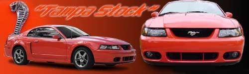
Another color variation.
__________________
"Genuine" ASE certified Mazda, Hyundai, Isuzu Technician
Escort Enthusiast Site
Automotive Electrical Specialist, Tuning Specialist
"Genuine" ASE certified Mazda, Hyundai, Isuzu Technician
Escort Enthusiast Site
Automotive Electrical Specialist, Tuning Specialist


